Introduction to the El Nino and La Nina Climate Phenomena
Growing up I remember the days when we would get +30 cm of snow overnight in Toronto, as well as the mild winters and its miserable rain. Some memorable winters include December 1999 when I remember waking up to 40 cm of snow, December 2006 when my cousin from the Azores visited during Christmas to witness one of the most mild winters I had seen, and the 2007-2008 winter when Toronto received record snowfall. It may seem like Mother Nature has a way of flipping a coin between winters with rain and snow, but it turns out there is a phenomena that causes some winters to be cold, while other be warm. It’s called the El Nino-Southern Oscillation.
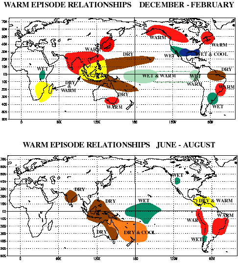
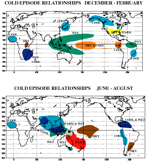
El Nino-Southern Oscillation, or ENSO for short, is a short-term climate pattern that causes abnormal conditions around the world. Depending on the time of year and location, a region may experience colder, warmer, drier, or wetter conditions than usual. It’s affects are felt across North America, South America, Asia, and Africa. Below are maps illustrating the regions impacted by the ENSO.
El Nino
La Nina
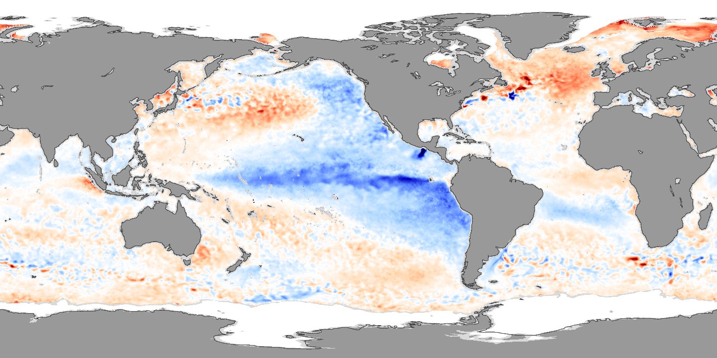
Sea Surface Temperature
The driving force for the ENSO phenomena is sea surface temperature in the Pacific Ocean. The surface temperature in the ocean is far from constant, which can be seen in the figure below. Colder than normal temperatures in equatorial Pacific lead to La Nina episodes, whereas warmer than usual temperature lead to El Nino episodes.
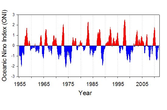
Meteorologists use the Oceanic Nino Index (ONI) as a measure of how Strong an El Nino or La Nina episode is. The ONI is calculated as the difference between the current ocean temperature and the historical average. Measuring the average surface temperature of the ocean can be challenging, so meteorologists use two techniques to smooth out fluctuations:
- They calculate the average temperature anomaly over a defined regions in the Pacific Ocean – Nino1+2, Nino 3, Nino 3.4, Nino 4
- They calculate a 3 month running average

The Oceanic Nino Index
The historical ONI is shown over the last several decades. ONI values above 0.5 are defined as El Nino phases, while values less than -0.5 indicate its La Nina counterpart. El Nino and La Nina can further be categorized as weak, moderate, and strong, but I wasn’t able to find consistent values that define these ranges. Remember who I said my cousin visited Canada during a fairly mild winter? That is the red peak in the ONI for 2007. Similarly, the 1999 and 2008 winters with large snowfall are the blue troughs in the ONI graph.
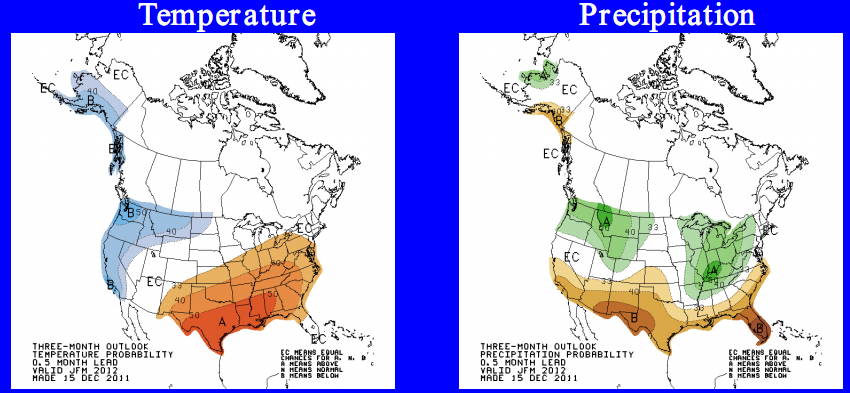
Currently we are in a La Nina phase, and this can be seen with the current 3 month outlook below, as issued by the Climate Prediction Center (NOAA). BC is expected to have colder temperatures and more precipitation. Toronto on the other hand is expected to have more rain and a higher probability of warmer temperatures.


Leave your response!