Making Sense of the HDI
In May and June 2009, my life was in a carefree limbo. I had just completed my undergraduate in April, and I was slated to begin my fulltime job in July 2009. I decided I would use my short lived freedom to sit in lectures I was never able to attend during my Engineering undergrad. One of them was World Politics, instructed by Bill Moul (PSCI 281).
On the first day Prof. Moul introduced the class to the HDI Index (Human Development Index), and how it can be used as a crude measurement of human happiness. He claimed that the difference between a country ranked 1 and 2 is somewhat insignificant, but there is a clear distinction between the top 25 and the bottom 25. These are the lists of countries he showed the class:
| Top Rank | Country | |
|---|---|---|
| 1 |  |
Iceland |
| 2 |  |
Norway |
| 3 |  |
Candada |
| 4 |  |
Australia |
| 5 |  |
Ireland |
| 6 |  |
Netherlands |
| 7 |  |
Sweden |
| 8 |  |
Japan |
| 9 |  |
Luxembourg |
| 10 |  |
Switzerland |
| 11 |  |
France |
| 12 |  |
Finland |
| 13 |  |
Denmark |
| 14 |  |
Austria |
| 15 |  |
United States |
| 16 |  |
Spain |
| 17 |  |
Belgium |
| 18 |  |
Greece |
| 19 |  |
Italy |
| 20 |  |
New Zealand |
| 21 |  |
United Kingdom |
| 22 |  |
Hong Kong |
| 23 |  |
Germany |
| 24 |  |
Israel |
| 25 |  |
South Korea |
| Bottom Rank | Country | |
|---|---|---|
| 1 |  |
Sierra Leone |
| 2 |  |
Central African Republic |
| 3 |  |
DR of Congo |
| 4 |  |
Liberia |
| 5 |  |
Mozambique |
| 6 |  |
Niger |
| 7 |  |
Burkina Faso |
| 8 |  |
Burundi |
| 9 |  |
Guinea-Bissau |
| 10 |  |
Chad |
| 11 |  |
Ethiopia |
| 12 |  |
Mali |
| 13 | |
Guinea |
| 14 |  |
Cote d’Ivoire |
| 15 |  |
Rwanda |
| 16 |  |
Eritrea |
| 17 |  |
Zambia |
| 18 |  |
Malawi |
| 19 |  |
Benin |
| 20 |  |
The Gambia |
| 21 |  |
Togo |
| 22 |  |
Timor-Leste |
| 23 |  |
Angola |
| 24 |  |
Uganda |
| 25 |  |
Lesotho |
Many people are probably familiar with HDI, or have at least heard it in the media. These are the articles that claim Country XYZ was the number one place to live in according to the UN. More recently, Norway and Iceland have been on top of the list. But I remember my Grade 7 teacher telling the class that Canada was rated the best place to live. This is a position Canada held from 1994-2000. Hey UN, thanks for letting us know. But how exactly did these people come to that conclusion?
Explaining HDI
The Human Development Index is based on a weighted average of three different statistics:
- Life Expectancy – How healthy are people?
- Education Index – How education are the people
- Gross Domestic Product – What is the standard of living?
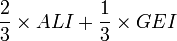
Each statistic is converted to a scale of 0 to 1 based on the following equations:
- Life Expectancy =

- Education Index =
- Adult Literacy Index =

- Gross Enrollment Index =

- Adult Literacy Index =
- GDP per capita =
We can conclude the following based on the structure of the equations: if a country has a perfect healthcare system, a perfect adult literacy rate, and a lagging economy in terms of GDP per capita, the minimum HDI it can achieve is 0.67. Countries like Canada have excellent statistics for all three areas, which is why its HDI value stands at 0.97 (close to a value of 1).
Why are you the way that you are?
Going back to the PSCI course… Prof Moul asked the class to formulate theories as to what caused the relative positions of the bottom and top 25 countries. Some of the theories I vaguely remember:
- Colonialism – European countries exploited African colonies for their resources, resulting in lingering economic and social problems when they left
- Settlement trends were starkly different in North American and Australia relative to African and Asian colonies. North American colonies were more homogeneous.
- Some countries are endowed with better agriculture and natural resources
- Countries with lower HDI’s are located in the tropics
- Corruption in the government
- Lack of political leadership
Each theory has its limits. For example, Singapore is a country in the tropics, a former European colony, and has little to no natural resources – yet it managed to fall in the top 25 countries in 2009. Hong Kong is another European colony in which Europeans did not create permanent settlements. Social theories will always fail if you test them thoroughly. The aim is to find a theory that fails the least.
Economic Activity and HDI
In GEOG 101, I had learnt of a model that describes how a country’s economy develops from a traditional economy to an advanced economy. The model is somewhat European-centric; in that does a great job at explaining what happened in Europe, but does not necessarily explain what will happen elsewhere in the world. Nonetheless, it’s still a good model worth explaining. Basically, there are three types of economies:

- Traditional – agriculture is the primary form of economic activity, which can be in the form of sustenance agriculture. This has been the dominant economy in the world for thousands of years. Just think Medieval Europe. Mostly farmers. Some weavers. Some merchants.
- Transitional – less people begin to work in agriculture as it becomes commercialized, allowing the more people to work in the manufacturing. Transitional economies began to appear after the Industrial Revolution.
- Advanced – Manufacturing jobs become replaced with higher value service sector jobs. This is the dominant economy in North American and Europe.
Hypothesis
My theory was that the type of workforce in a country’s economy correlated with its relative HDI rank. The more a country’s economy was based on agriculture, the lower its HDI rank. The more people that were employed in the service sector, the higher the HDI. My reasoning behind this idea was the following:
- Health care is too expensive for countries that have a low standard of living.
- There is little need for education for a country that lacks industrial and service jobs.
- Agriculture, especially hand-to-mouth sustenance agriculture, has a low economic value. Higher GDP per capita can be achieved with industrial and service jobs.
Results
I compiled statistics showing HDI values for countries, and the breakdown of the labour force based on the economic sector.
 Analysis in Excel (Right click to Save As)
(Data disclaimer: I found estimates for the labour force from The CIA World Factbook, and the HDI values from the 2008 Report)
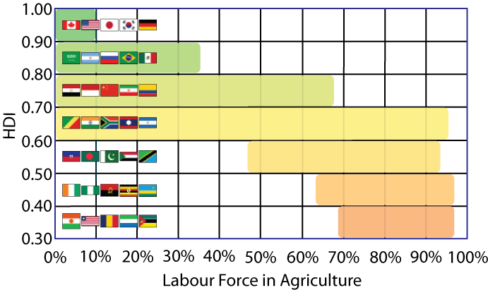
I have the data displayed in two types of charts. First, I organized the data by “buckets of countries”. The first bucket is the top 25 countries, the second bucket are countries 26-50, etc. I calculated the average and a 95% confidence interval for each bucket.
The second set is purely based on the HDI value. The reason I chose to do this is because the HDI range can increase if you lump together countries based on a rank. What if countries ranked 26-100 all had an HDI of 0.75? Then you’d have three buckets of the same data…
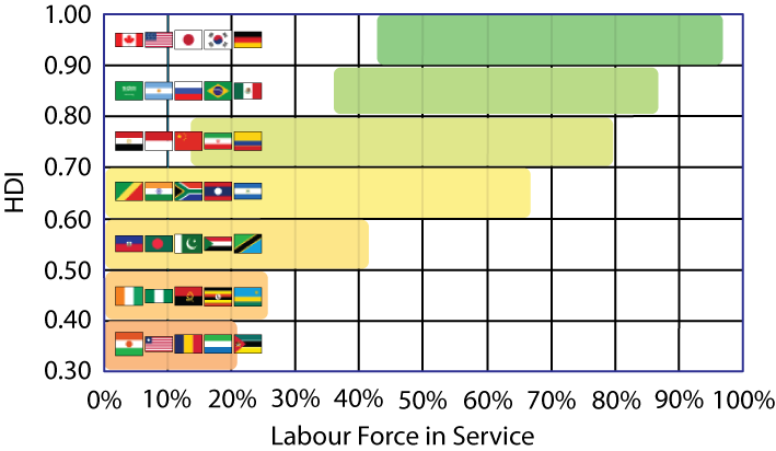
Top 25 vs. Bottom 25
A couple of things to point out in the graph below… First of all, the top ranked countries occupy a very very small space that is less than 10% in agriculture and above 0.9 on the HDI scale. This shouldn’t surprise anyone as these are the countries that have industrialized / mechanical agriculture (a relatively small number of farmers can yield enough wheat from the Prairies to feed the entire continent with Trix cereal). As you move to the lower ranked buckets there is a gradual progression towards more people working in agriculture BUT it isn’t statistically significant from one group to the next. That is until you get to the bottom ranked countries. There is a clear gap between the top 50 and the bottom 29, whereas the countries create a continuum (more on this later).
![]()
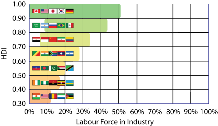
The graph for the service sector has some resemblance to the agriculture graph above. The only difference is that there is a positive correlation between HDI and labour force in the service sector. The range for the top 25 countries is somewhat larger than the agriculture range, which simply means that some countries rely on the industrial sector than others.
![]()
Overall HDI Analysis
Conclusions
Overall, the percent of people working in the agriculture and service sector had the strongest correlation with HDI rank. There is essentially no significant statistical trend between an industrial labour force and HDI. Prof. Moul was essentially correct in his view that the difference between countries in the top of the list are insignificant, especially when you compare the top and bottom 25.
When I was thinking about what caused the relative HDI ranks, I had a feeling that an advanced economy was the driving force behind life expectancy and adult literacy. I was wrong. This was true for countries in Europe and the United States. To steal a saying from Hans Rosling, Western countries became wealthy before they became healthy. But over the last 50 years many countries around the world have become healthy and educated before achieving economic growth. China and Cuba are countries that have been able to quickly become healthy, followed by economic growth. This explains why there is a continuum of countries with HDI ranks from 1 to 125; however, there is a clear gap between the top 125 countries and the bottom 50 countries.
References and Interesting Links
United Nations Human Development
If you want to check out more details about the HDI numbers, you can check out this UN site. It provides more detail behind the HDI value. For example, Canada is currently ranked 4th for HDI, based on a life expectancy of 80.6 (ranked 11th), a gross enrollment ratio of 99.3% (ranked 7th), and a GDP per capita of 35 812 (ranked 18th).
Hans Rosling @ TED Talk
Gap Minder.org
Gap Minder.org
After you’ve seen some of Hans Rosling’s presentation, you may want to check out GapMinder.org. In the spirit of sharing, Hans has made his software available for the world (an interesting note is that it was acquired my Google). This web app allows you to easily test hypothesis and better visual world statistics. Check it!
Paul Romer @ TED Talk
Another TED talk that is somewhat relevant is Paul Romer’s Charter Cities. Basically, Paul believes that the UK’s influence on Hong Kong has been a seed of economic growth in China. He argues that the same model could be applied to other cities in the world to bring poor countries out of poverty.
World Mapper
World Mapper is another interesting site that shows a lot of visual statistics. Most of the maps are based on cartograms. The size of each country is proportional to the statistic. For example, the map below shows the amount of public money spent on health care.


Leave your response!